Change Geography Map Visualizations in Analyzer
The Properties panel enables you to customize the appearance of map visualizations.
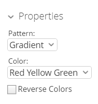 |
The Pattern drop-down box allows you to decide the way the colors of the pins populate. The appearance does not denote any of the data, it is solely for aesthetics. You have the option of choosing:
Gradient
3 Step
5 Step
The Color drop-down box allows you to decide which colors denote large measures and which colors denote smaller measures. The color denotes the size of the data, from small to large. You have the option of choosing:
Red Yellow Green
Red Yellow Blue
Blue Scale
Gray Scale
You also have the option of checking the Reverse Colors box, which will allow you to choose the inverse colors, so they appear from large to small.