Change Heat Grid Visualizations in Analyzer
The Properties panel enables you to customize the appearance of map visualizations.
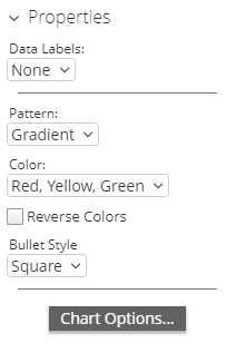 |
Use the Data Labels drop-down box to label the data features of your report with what is represented. You can also choose no Data Labels or specify where you want them to appear.
The Pattern drop-down box allows you to decide the way the colors of the pins populate. The appearance does not denote any of the data, it is solely for aesthetics. You have the option of choosing:
Gradient
3 Step
5 Step
The Color drop-down box allows you to decide which colors denote large measures and which colors denote smaller measures. The color denotes the size of the data, from small to large. You have the option of choosing:
Red Yellow Green
Red Yellow Blue
Blue Scale
Gray Scale
You also have the option of checking the Reverse Colors box, which will allow you to choose the inverse colors, so they appear large to small. You may also change shape of the measures in the Shape: drop-down box. The measures can be alternated between Square to Circle.
The Properties panel enables you to customize the appearance of scatter chart visualizations.